Case Study: Hormona new premium feature; Learning Modules
art direction, marketing strategy, branding, creative direction
-
Defining the art direction for a new product feature. This can push the boundaries of the existing brand style guide to potentially reach new consumers.
-
Concept 6 art directions, half in illustrative and half photography focused. Organize a sequence of qualitative and quantitative research feedbacks with consumers to gauge the impressions of the creative, and then review internally with the team for final weigh in.
-
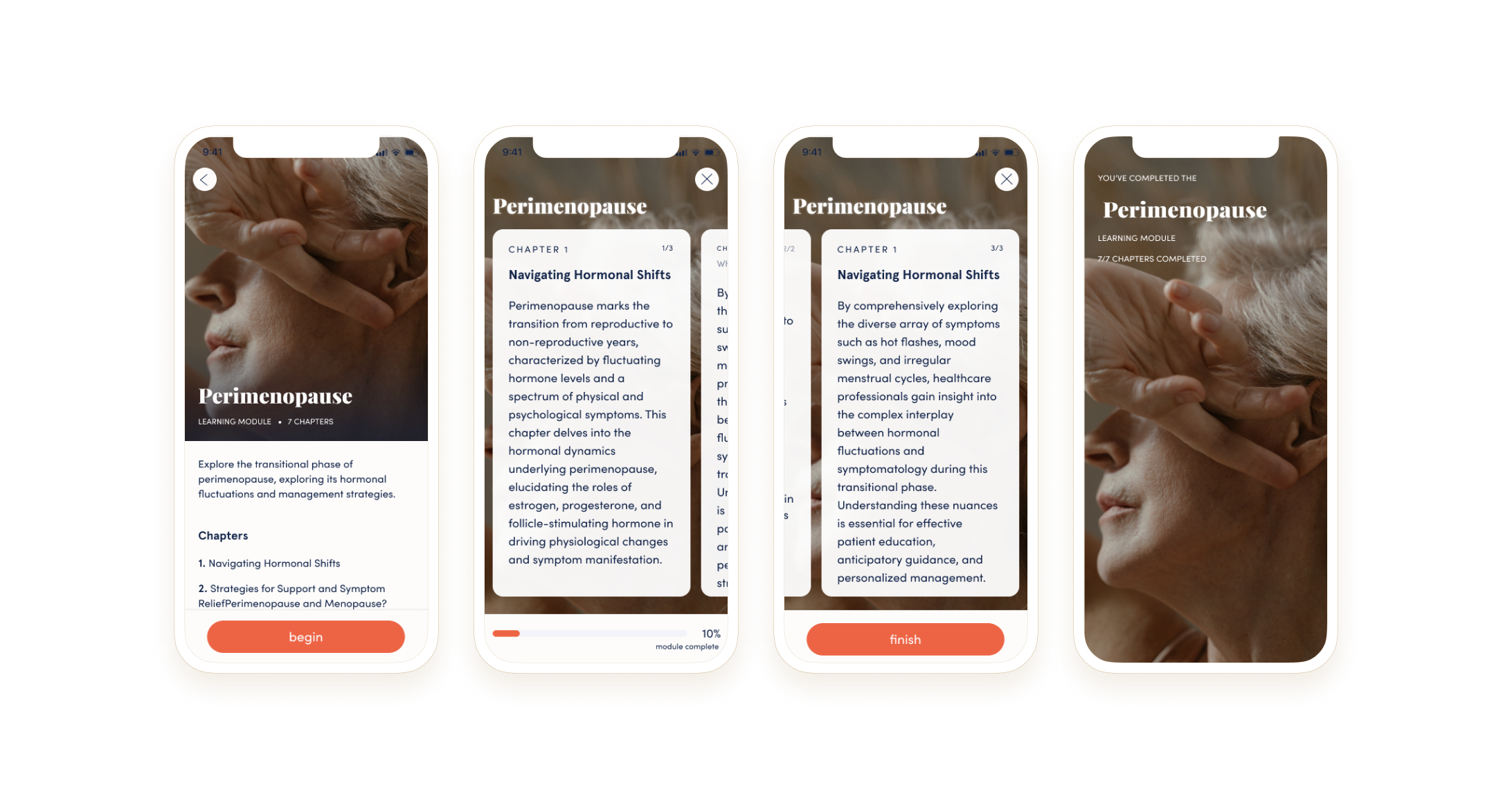
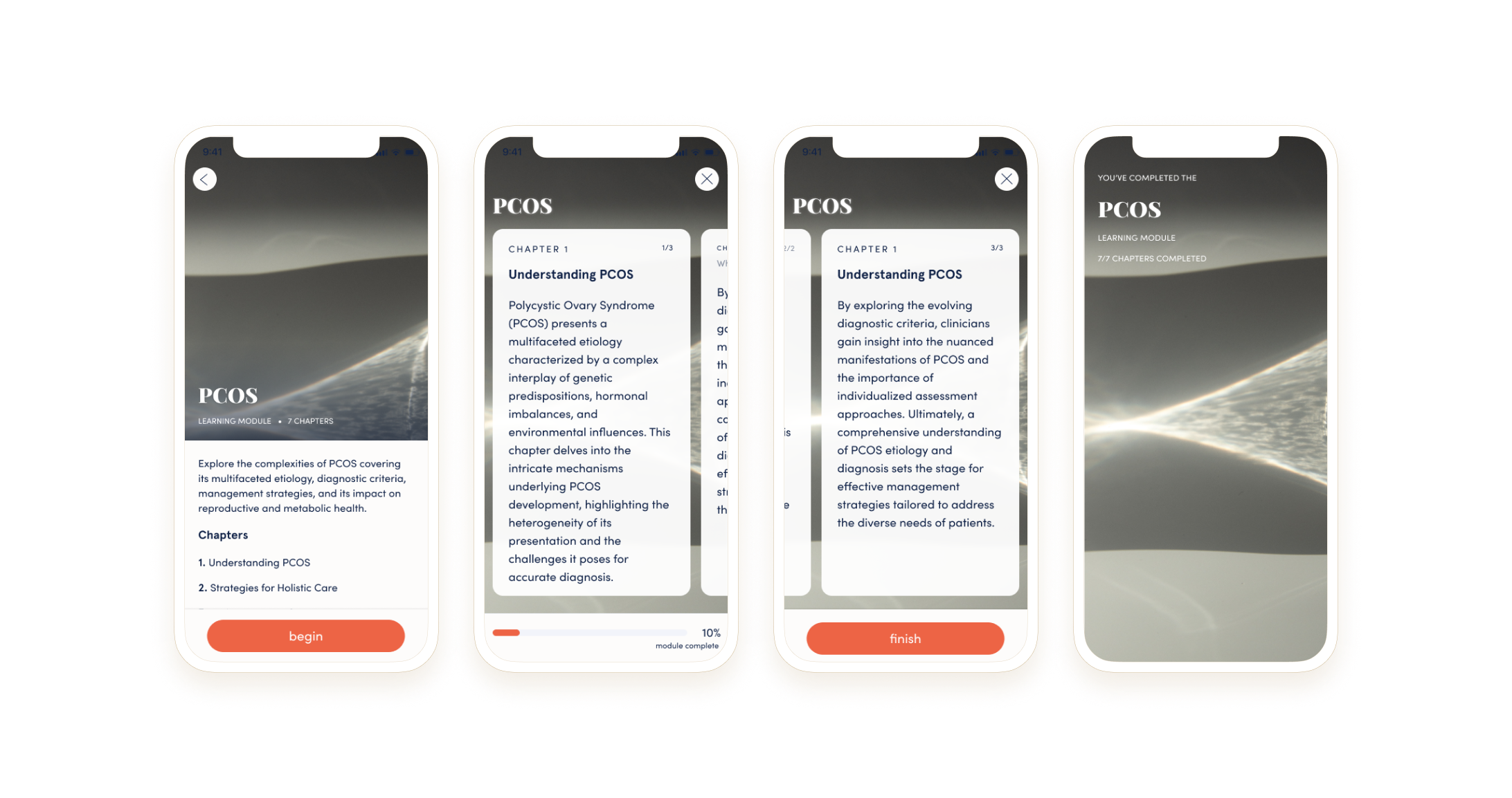
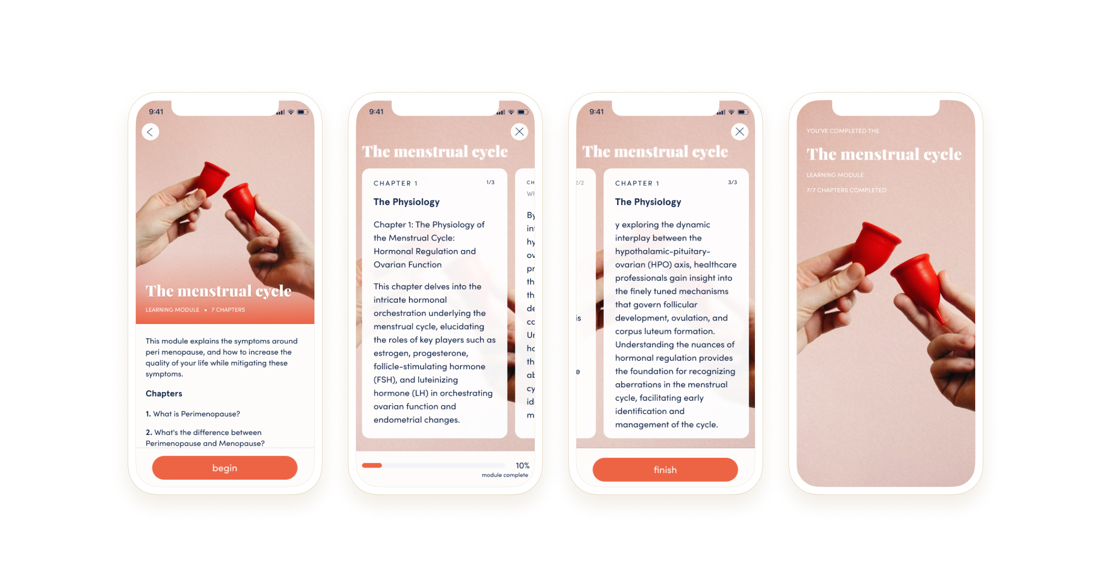
In 2022, Hormona became serious about pumping out attractive premium features to encourage its consumer base to ramp up their subscriptions. This came with all sorts of new product offerings; namely educational content - enter the learning modules.
With the new learning module content launch, the creative team wanted to explore a new art direction style, as these features could resonate with an unexpected user group.
-
It was my roll to explore 6 broad directions of visual style, and test these art directions with reflective Hormona app users for evaluative feedback on a creative direction.
The Assumptions
The founders assume that bringing in illustration will bring a fun and modern look to the brand.
The designers believe that having an artistic or serious photography, and a brand led photoshoot would provide Hormona with appropriate assets that compliment the brand and protect the maturity and uniqueness.
The Process
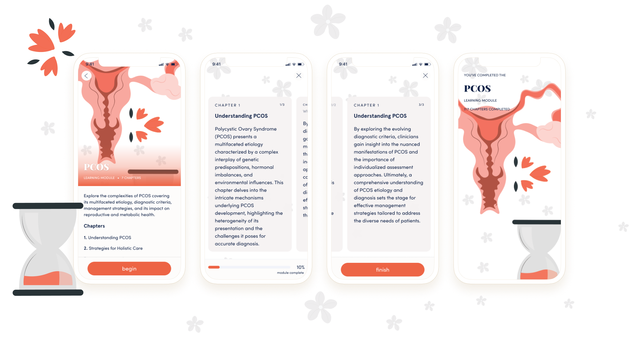
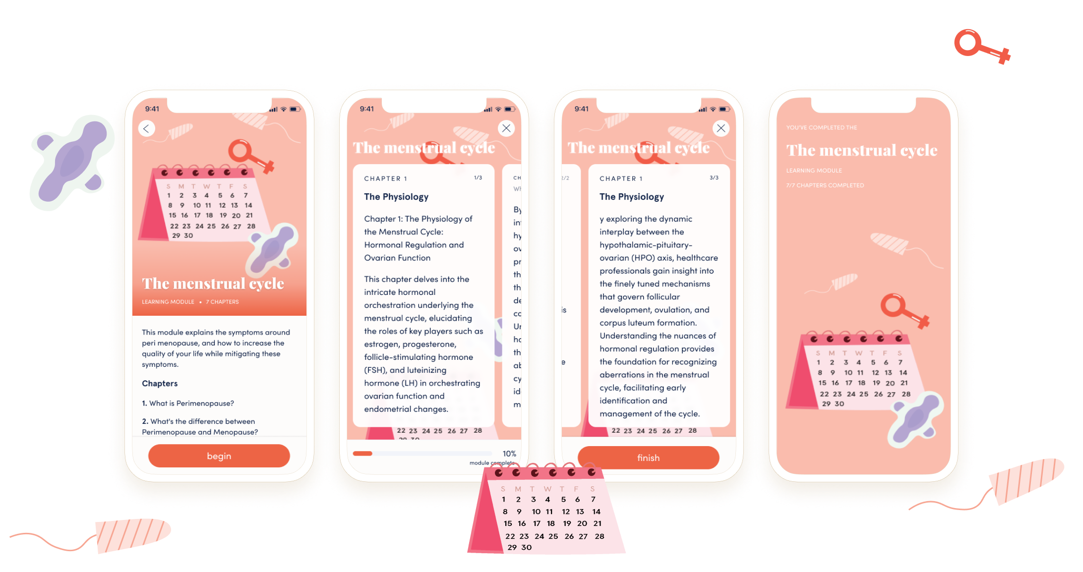
As the creative lead on the project, I took one day to produce these 6 creative directions. For the illustration, I explored one direction with character design, a second that looked more editorial and artistic, and a third that was flat UI and trendier illustration. For photography, I sourced several stock photography sites to find the appropriate themes that went in the Pop Art direction, artistic abstraction, and serious mature photography of real women. Each of these 6 directions was a generalized look and just the starting point for each direction. Once a direction was prioritized, there would be further visual exploration, but for now I limited the 6 direction exploration to one day of ideation.
The Methodology

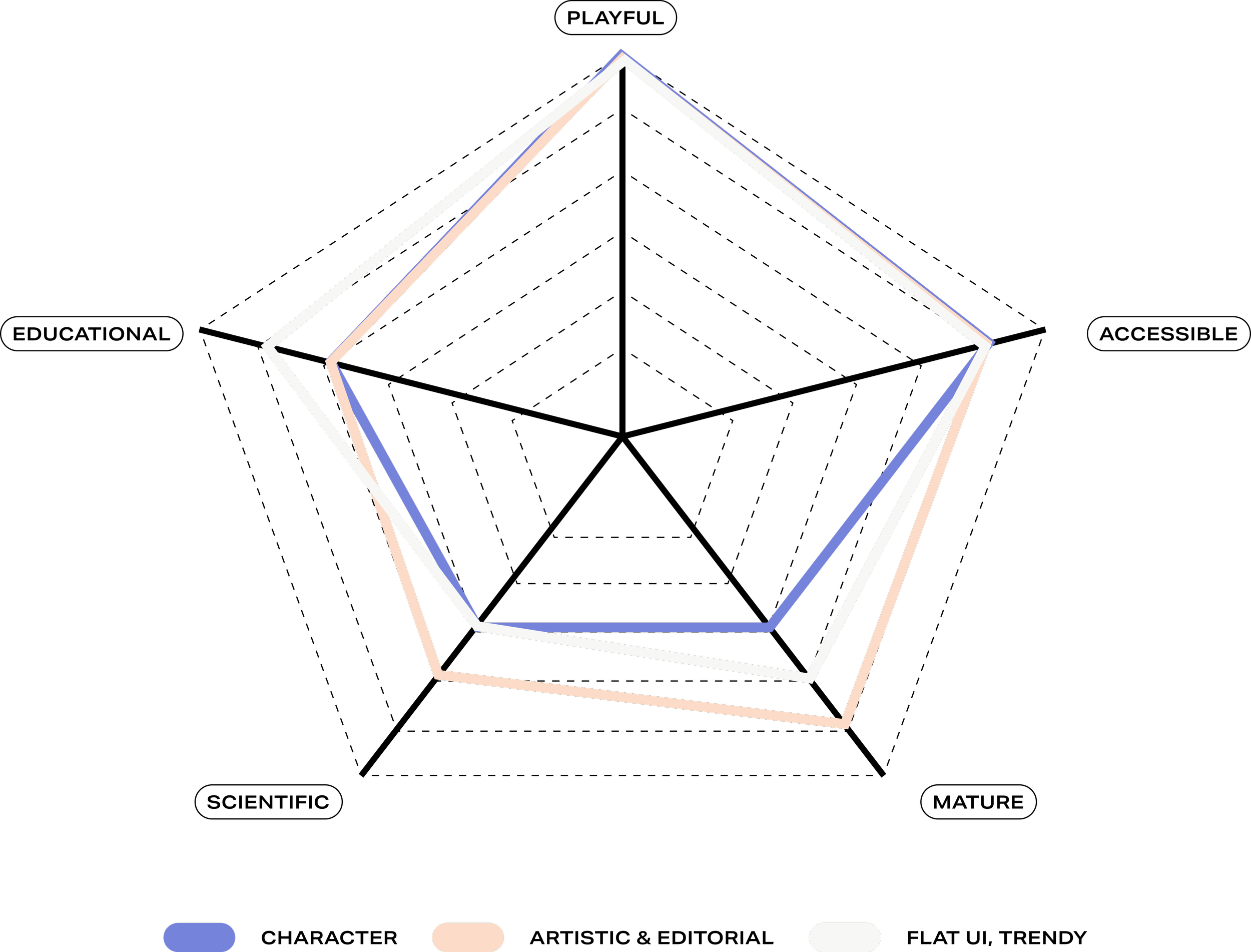
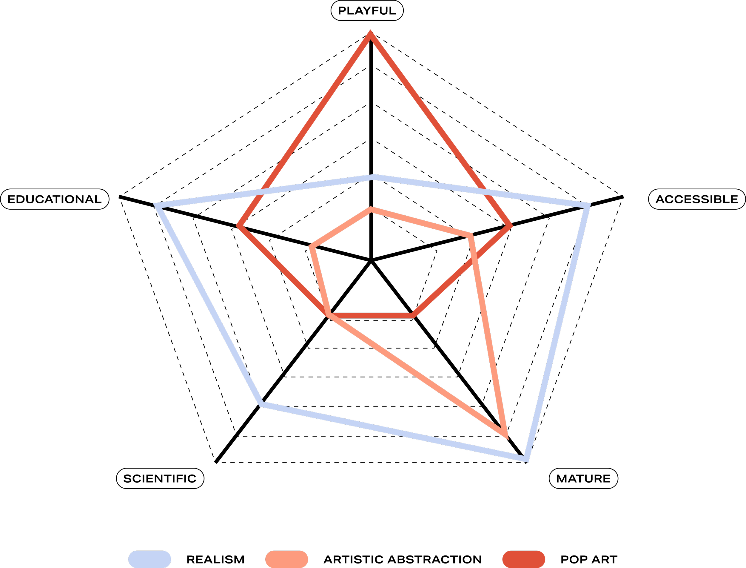
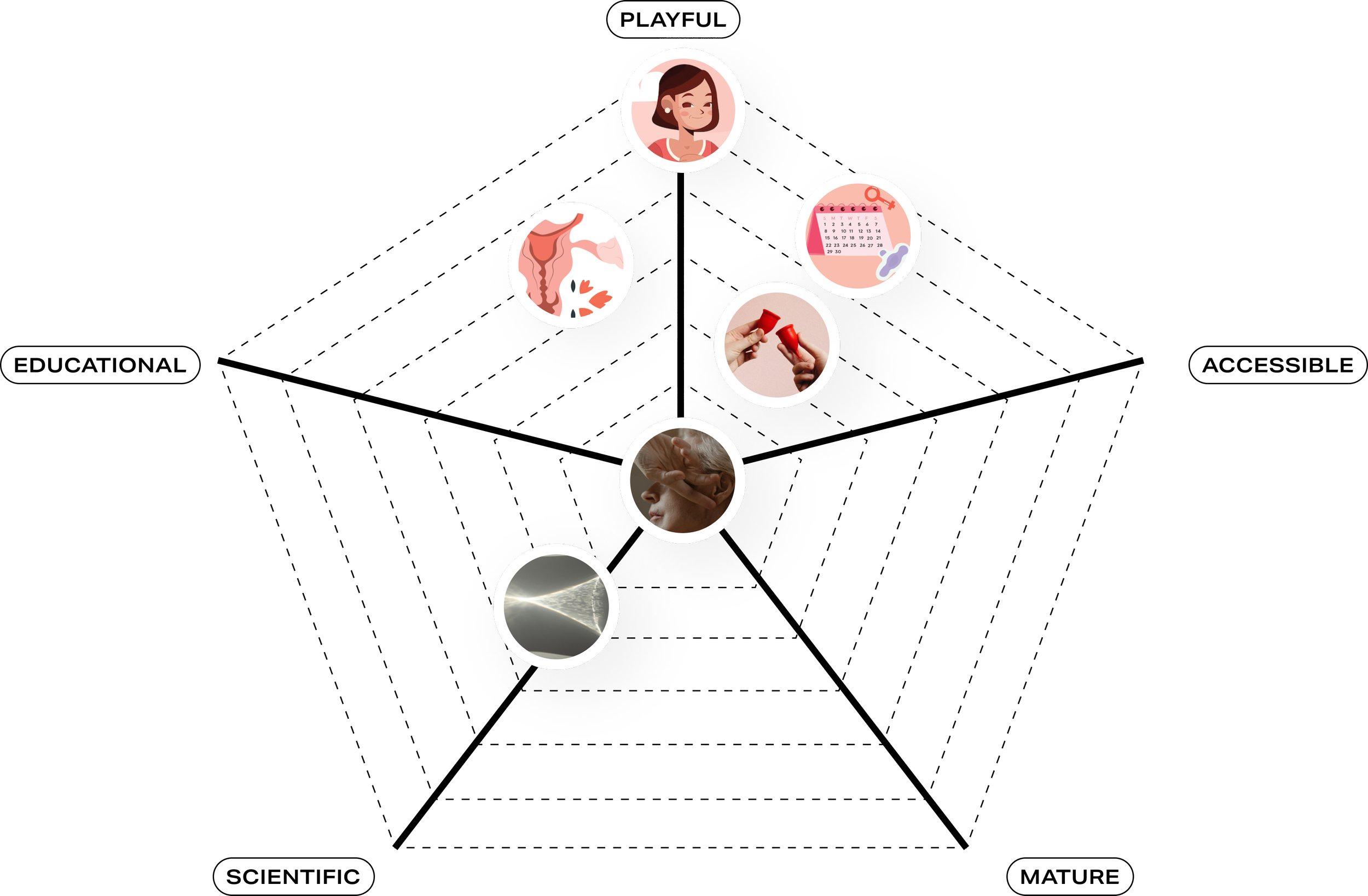
I mapped out the respective art directions into a spiderweb map with each cornerstone defining a tone of communication to take with the community - playful, accessible, mature, scientific, and educational. The purpose of this spiderweb map was to visually capture the perfect balance of these cornerstones to achieve a feeling of empowerment for the community.
ILLUSTRATION DIRECTIONS
Direction 1:
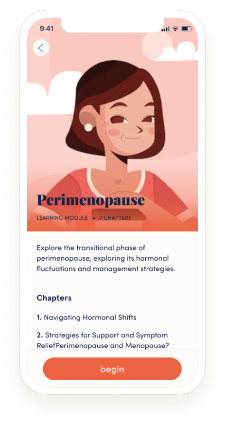
Character-driven
Direction 2:
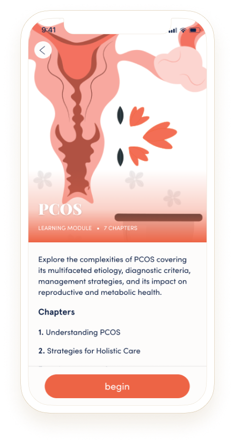
Artistic & Editorial
Direction 3:
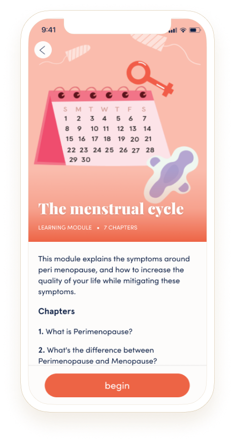
Trendy & Flat UI
PHOTOGRAPHY DIRECTIONS
Direction 4:
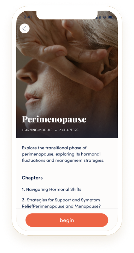
Realism
Direction 5:
Abstract & Artistic

Direction 6:
Pop Art
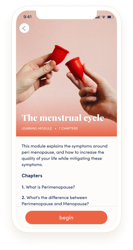
Illustration Art Directions
For the three illustration directions:
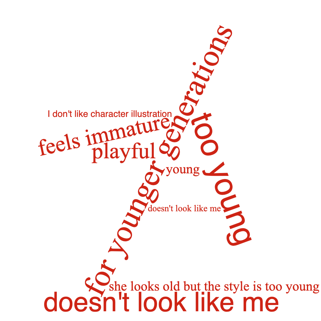
Character based illustration: strong in playfulness, less mature, more accessible as it focuses on character experiences
Artistic & editorial: playful, but more scientific through anatomical graphics than the character based illustrations
Flat UI: very playful, less mature but more accessible, as it focuses on relevant objects in the lesson


Photography Art Direction
For the three photography directions:
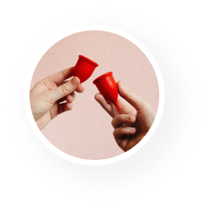
Realism: strong in accessibility by showcasing real women and their experiences through emotion-driven photography
Artistic abstraction: abstract interpretations of the content, therefore more mature and less playful
Pop art: playful, subjective, not as accessible as it does not capture women, more object focused photography


Testing plan
I needed hard data to showcase the founders and greater creative team in order to eliminate creative options. Together with an multi-disciplinary inner circle of teammates, we created KPI’s and testing goals in order to help us reach the artistic direction for this product feature. Within UserTesting.com, we created questions that probed targeted users on how each of these creative assets made them feel.
Ex:
In 5 words, what words come to mind when you see this screen?
How would you describe this visual style?
According to this lesson and how it looks visually, would you recommend this lesson to your mom, your grandmother, or a young girl?
Qualitative feedback word cloud of visual impressions


Key Performance Indicator Metric Setting
We also aligned as a team on the Key Performance Indicators we would be looking for to measure success of the creative style.
Ex:
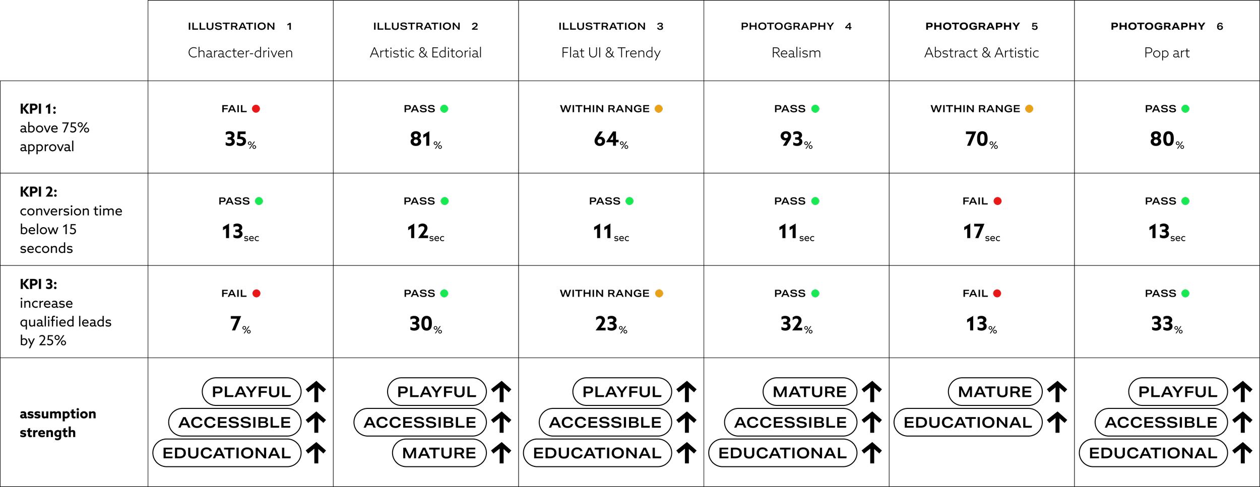
KPI #1: Above 75% Approval: From 0-100%, how would you rate this screen according to your interest in the lesson based on the visual presentation?
KPI #2: Conversion time below 15 seconds: I created a prototype that would enable testers to click through the learning module. If we saw drop off, or task time exceed 15 seconds, it was a failure.
KPI #3: Increase qualified leads by 25%: A company standard at this point in strategic development required that all new features needed to surpass 25% increase in qualified leads in beta testing, so this KPI was a standard procedure.
Resulting mapping of art directions
After assessing the quantitative and qualitative consumer feedback, as a team we were able to map the art directions back to our spider web map of pillars the brand wanted to position themselves as. Our goal as we set out was to achieve a balance between the 5 pillars, Playful, Accessible, Educational, Scientific, and Mature, in order to harmoniously arrive at empowerment.
Results
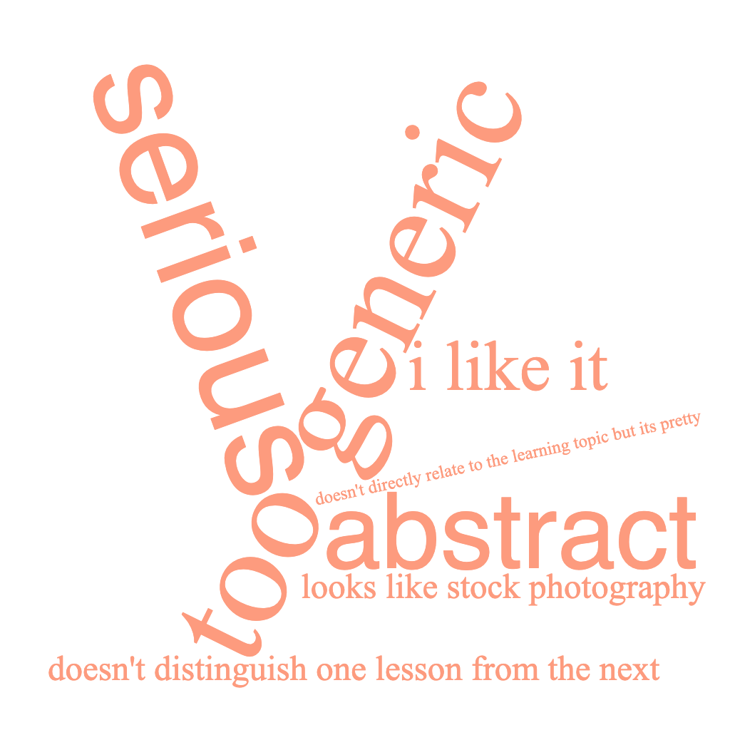
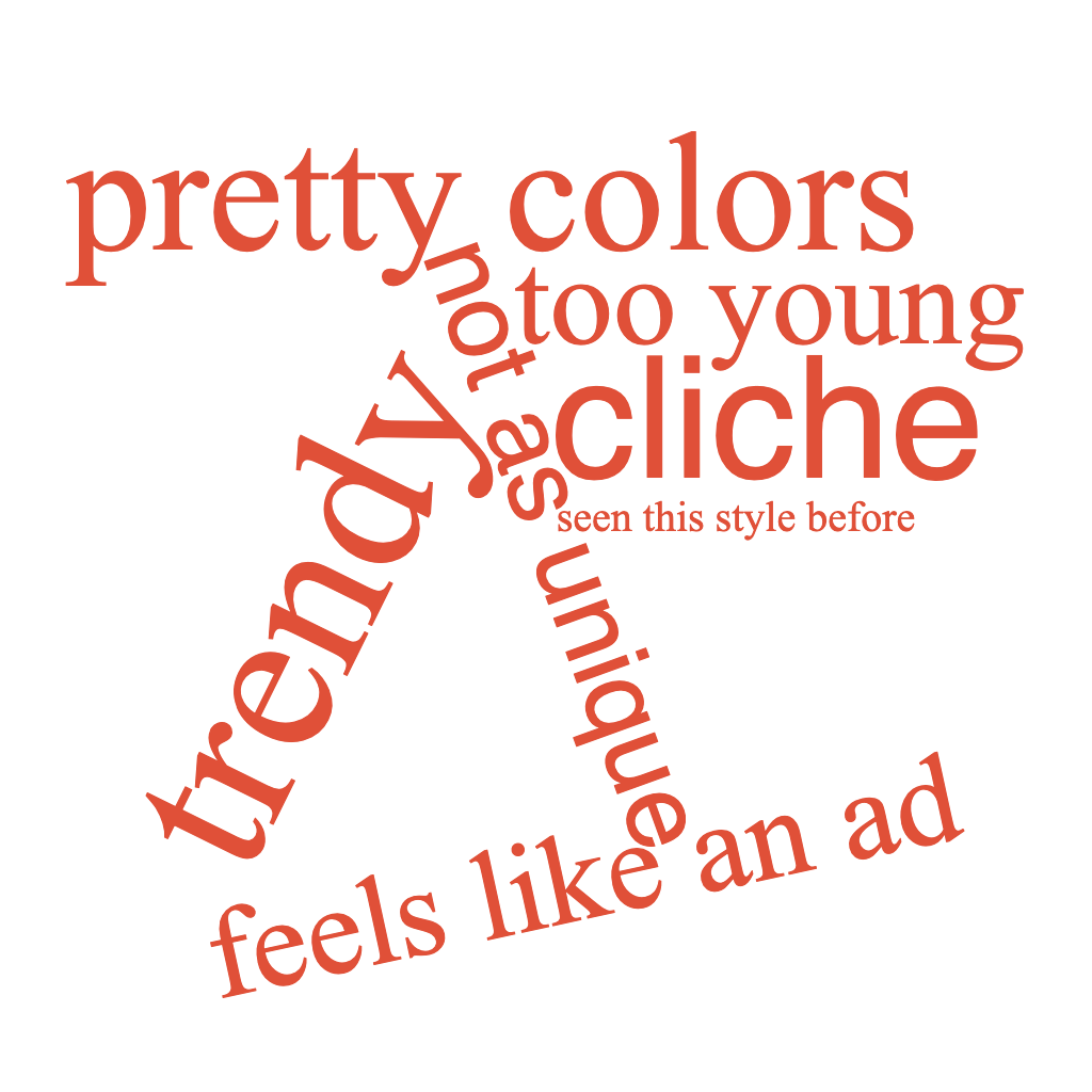
Based off of the testing procedure, the qualitative inputs from entry fields and testing reports via UserTesting, the photography directions were generally more successful than the illustration work. An interesting insight we saw was that many testers felt that while the illustrations were modern, they felt a bit “young”, “immature”, and not relevant for the actual community members - and in this case that renders our attempts to create accessibility and representation useless through illustration.
We let the approval rating and increase in qualified leads guide the major decision making, as the time to task was not as accurate of a measuring as this was a static prototype and not a live interaction with the actual app. Because we were measuring creative artwork, we wanted preference and approval to outweigh the other metrics.
Photography directions:
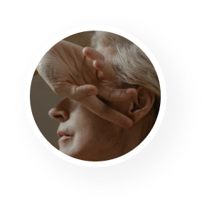
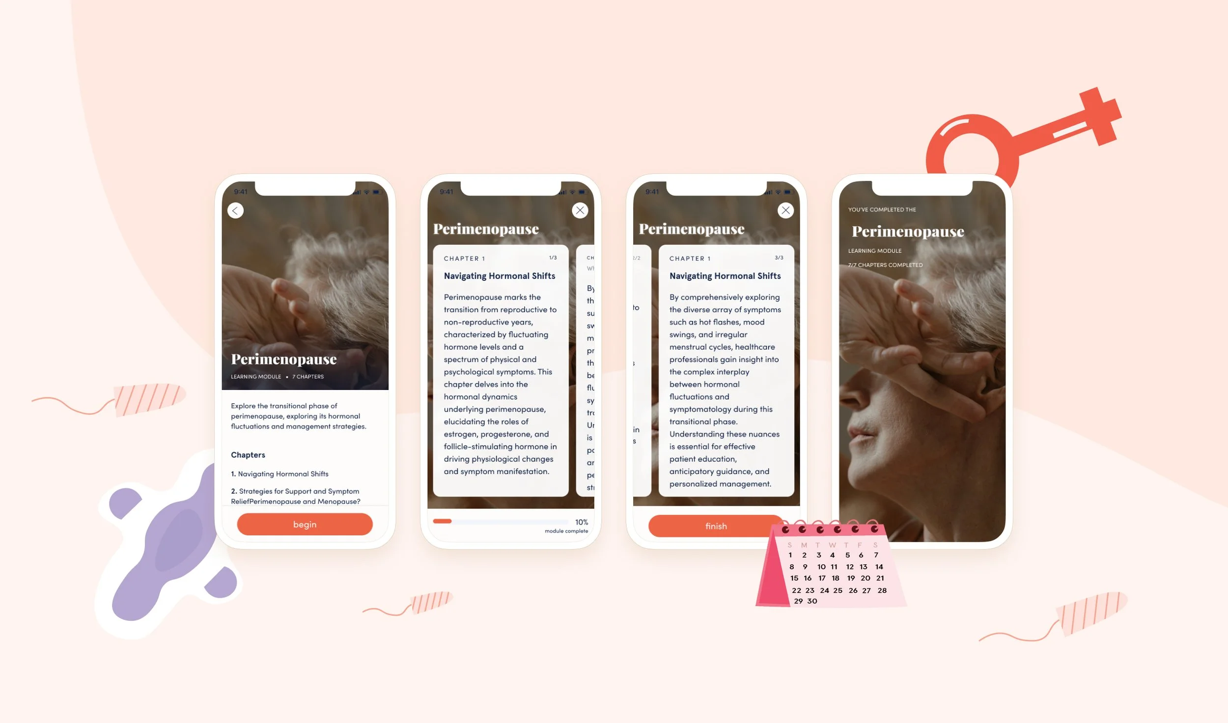
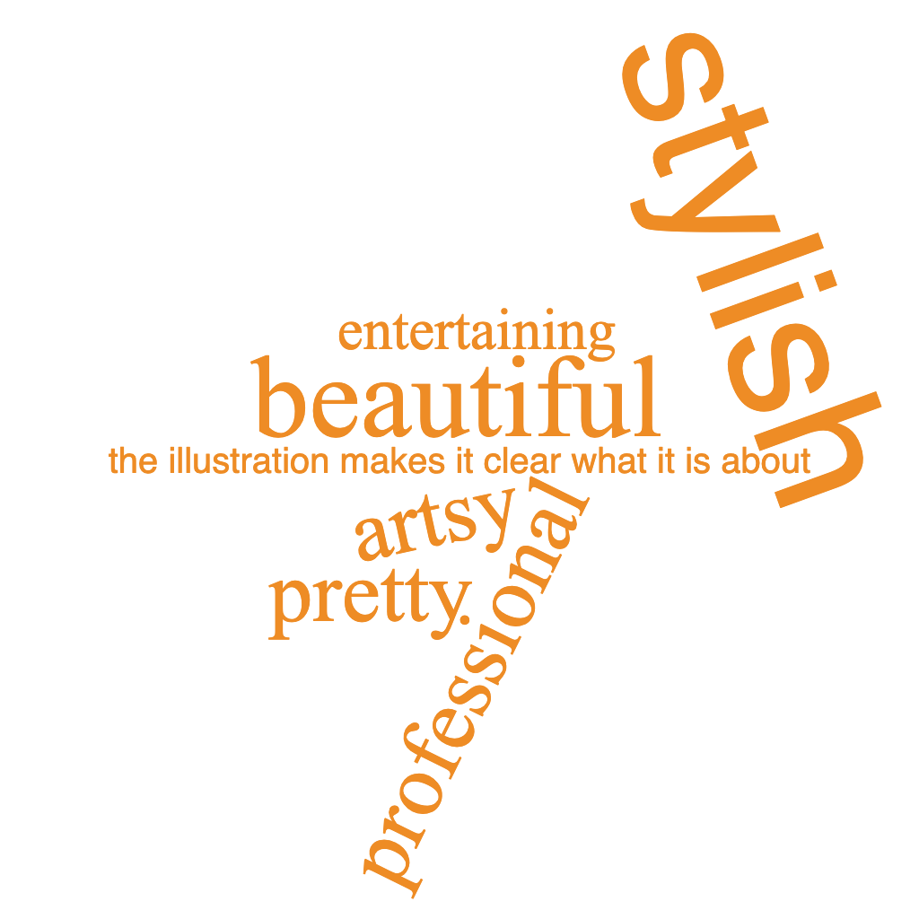
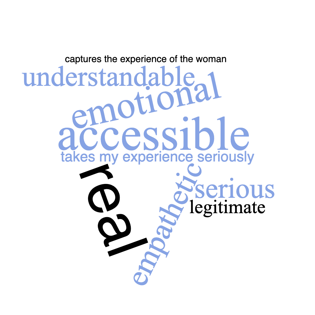
Direction 4, Realism: Best result overall. Increase of leads was strong as well as approval. The theme also triggered qualitative works like, emotional, empathetic, realistic, and accessible , which was the specific qualitative metric we were aiming for with the creative direction to achieve empowerment.
Direction 5, Abstract Artwork: The approval rating was closely within the targeted range, however, we were concerned that the content would not always be clear with the abstract artwork. The founders already were the least confident with this direction, and ultimately we decided that the Hormona community would likely not develop a strong affection value with the less personal, cold and abstract artistic direction.
Direction 6, Pop art: The key work that put us off from this direction in the qualitative feedback was that this direction looked like a partnership ad, and not something created in house for the community. We knew the photography direction would be a stretch to overcome the “stock photography” look and feel, but we felt that while the approval was high, and the qualified leads were within range, the qualitative feedback indicated that the community might have interpreted this is a paid ad or content, and therefore not take the medically accurate lessons at face value.
With the combination of qualitative and quantitative insights, the team and I were able to make a confident, low cost intensive decision on which creative direction should be launched with the new premium offering, in order to strive for the greatest success with the new feature launch. We decided to move forward with the Direction 4 photography style, Realism. View below the prototype for the full experience.