Case study: Hormona, new marketing webpage
marketing design, brand design, ux/ui, brand strategy
-
Hormona was having critical investment conversations with high level VC's for next round funding. Hormona was aware that investors were looking to support Femtech brands that promoted their science and medical legitimacy while preserving brand identity to consumers.
-
Explore new marketing webpage that outperforms previous website visual identity but demonstrates more of a scientific, medical legitimacy appeal to both consumers and investors.
-
Two years after first launch, Hormona was debating if they needed a website visual rebrand. This initiative came from their meetings with high profile VCs and investors who would be giving Hormona funding, as well as press teams and incubator programs that would lift the brand into competition. As Hormona was prepping to additionally add hardware as a physical product into the offering and needed support from investors, they needed a brand identity that communicated medical legitimacy while staying aesthetically pleasing.
-
This project required weighing perspectives across internal & external stakeholders, and letting data lead discussions in decision making for the new creative direction. As the lead designer on the project, my role was to explore a new creative direction and provide ideations in tandem with data, so that the founders could make clear final decisions and take the data back to their investors to justify the decision making.
The process
We had an initial website introducing the brand and app as a product from Hormona’s initial launch. Our plan was to make a rapid iteration of a new website, using the same content and only manipulating the visual direction, and then perform an A/B test, with the old and new solution to gain data-driven insights on which solution was better.
Stakeholder management
Design team wants
a coherent design system that didn’t introduce more inconsistency. A system that pleased the founders and investors as much as the target audience
Founders want
their investors happy, and the target audience to expand to no longer isolate older generations
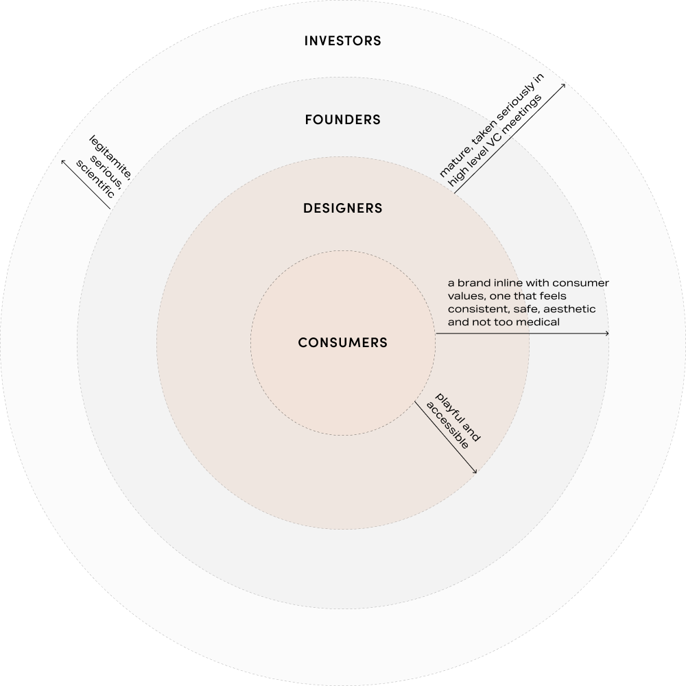
Investors want
a mature brand that had a research backed, and medically legitimate look and feel
Consumers want
a fun brand that spoke to them directly, where they felt that their data was legitamite, but still fun, playful, and not sterile feeling
The design iterations
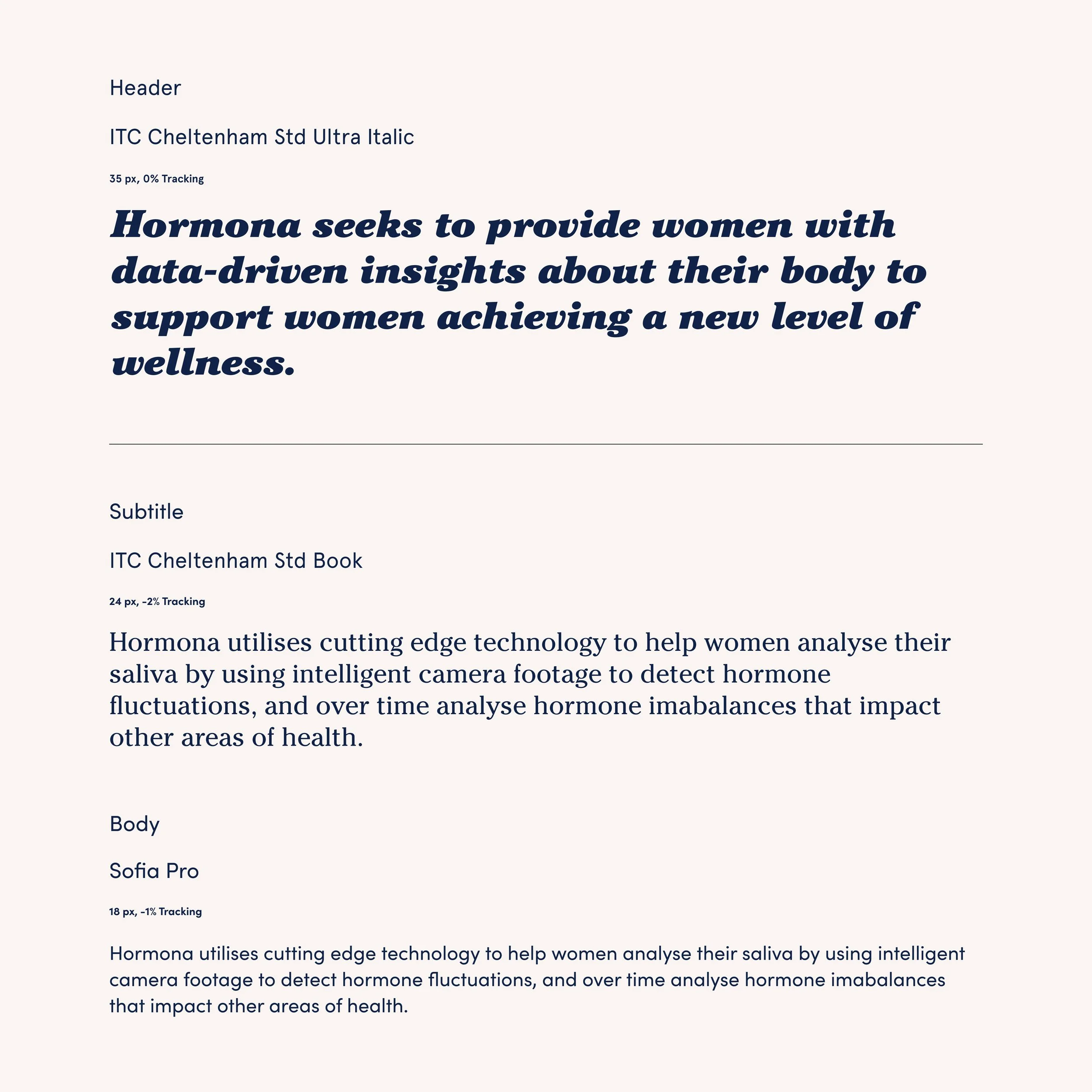
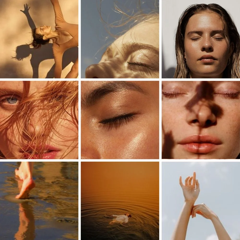
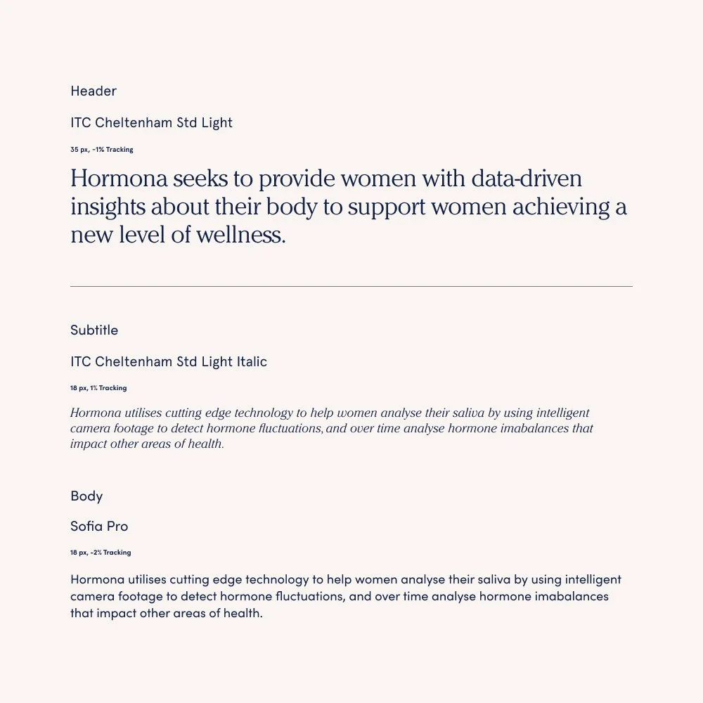
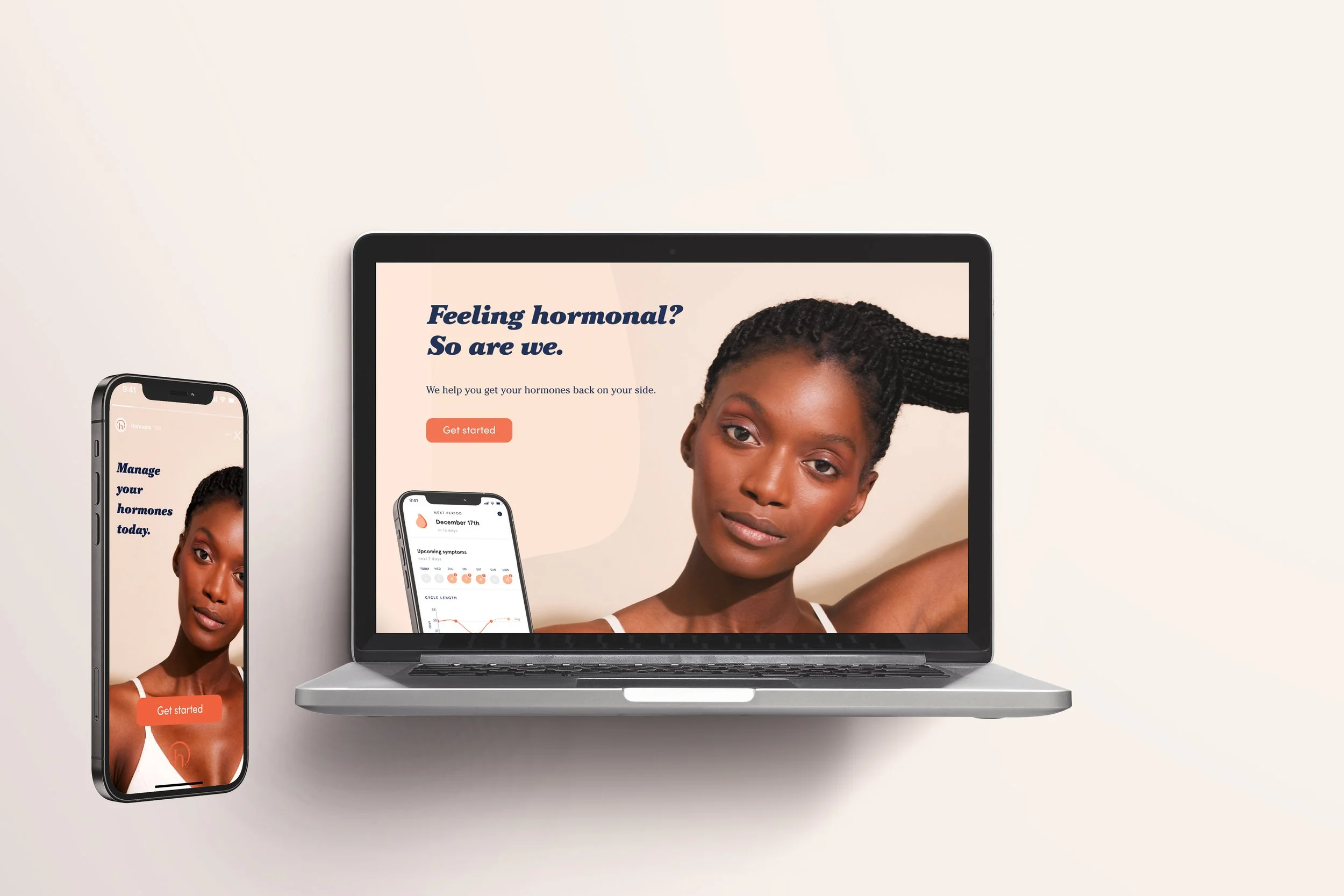
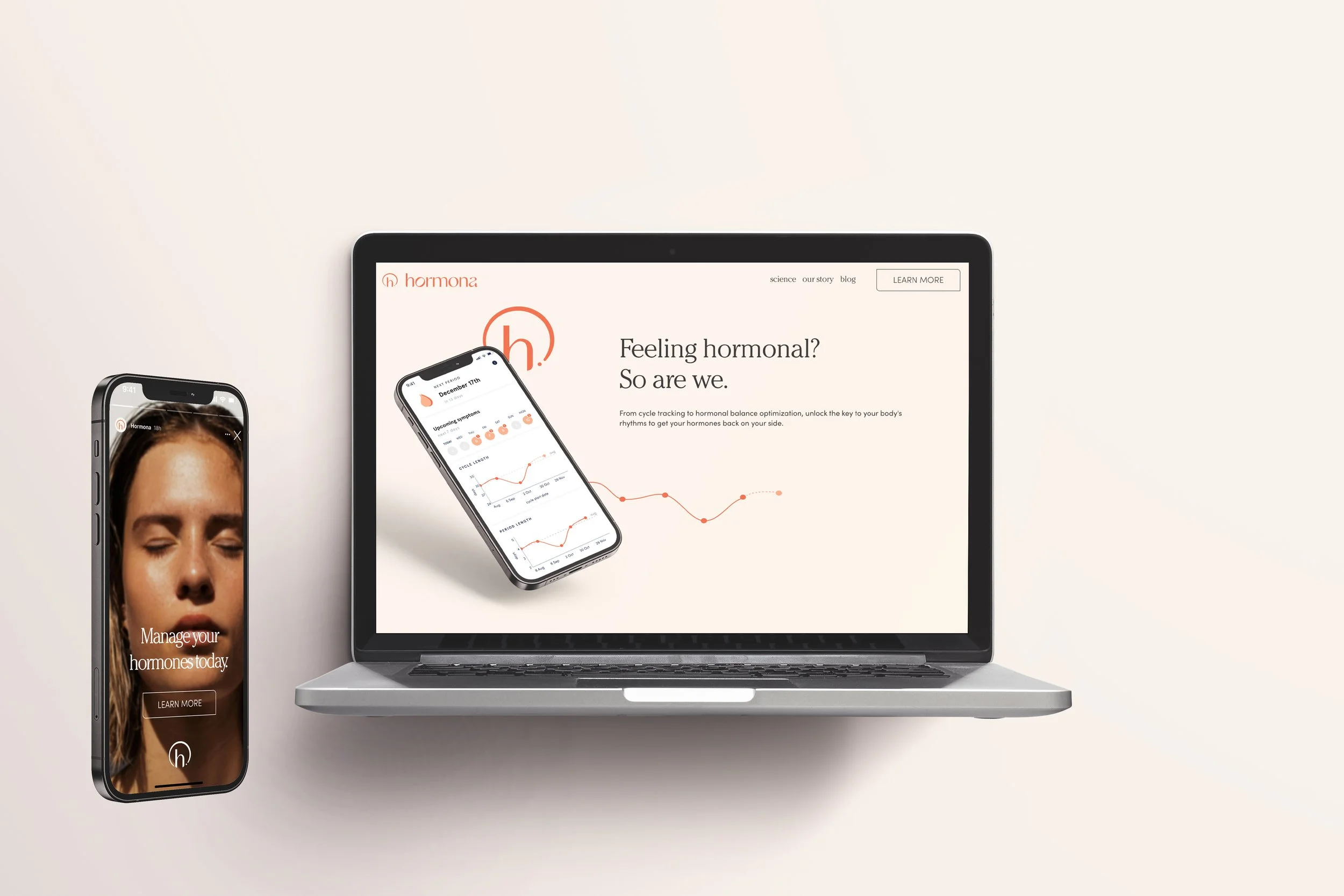
Exploring within the existing colors and fonts, I looked to manipulate only the hue of the already existing brand colors, and looked to find solutions in the font weight variation, rather than reinventing the wheel and starting from scratch with new brand colors and fonts. I additionally explored a new photography direction for the B website version, one that communicated greater maturity, seriousness through meditative emotion. This photography direction opened the door to more realistic emotions rather than an advertise-y look and feel.
Photography style 1:
trendy, healthy, community, youth
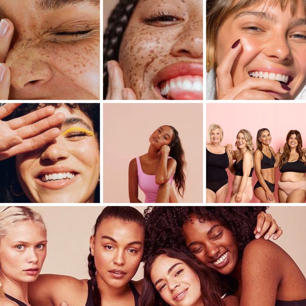
Photography style 2:
wellness, indulgence, luxury, peace, mature, solitude
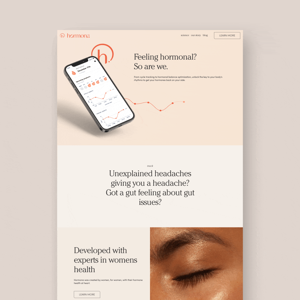
The design solutions
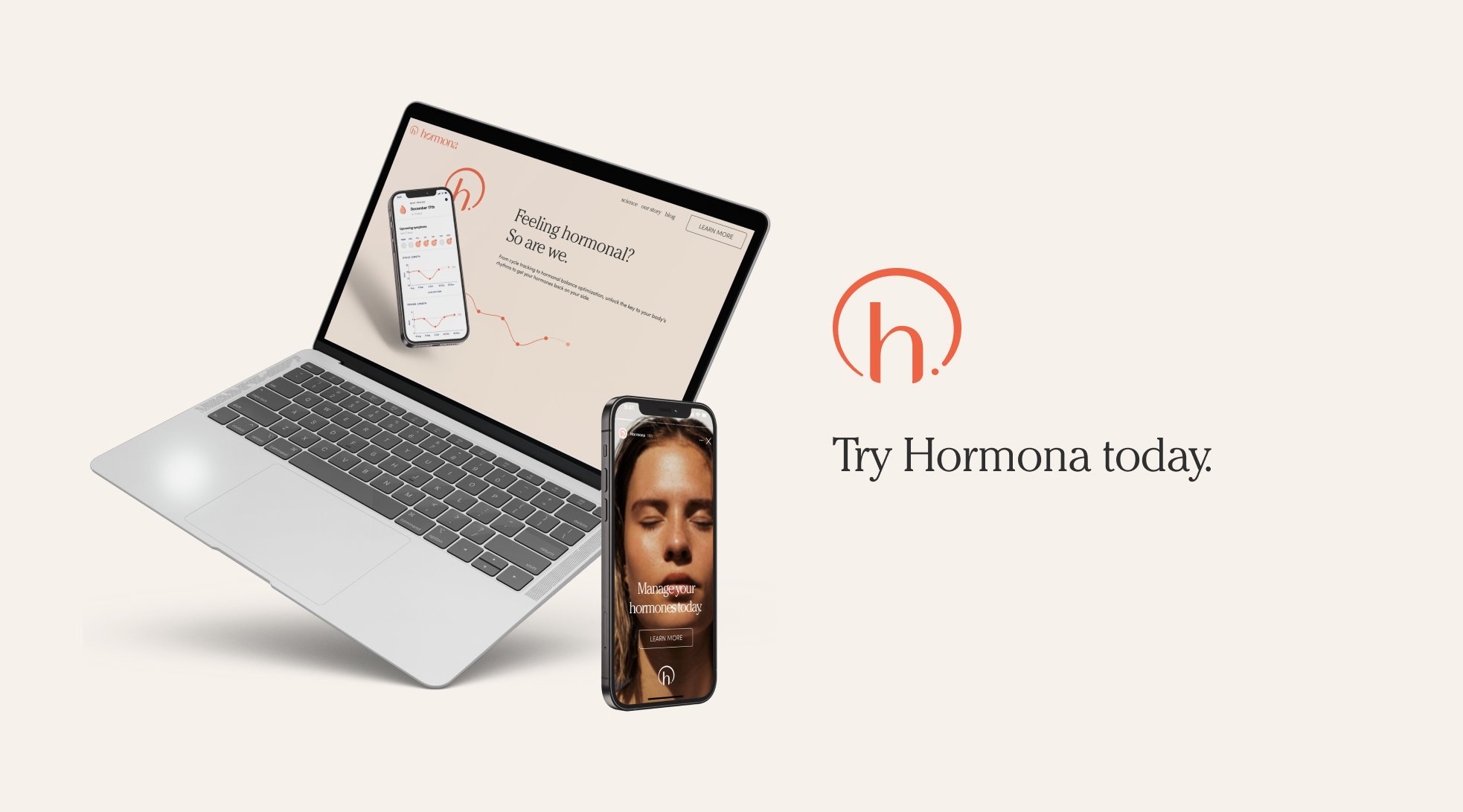
“A” Test: the original

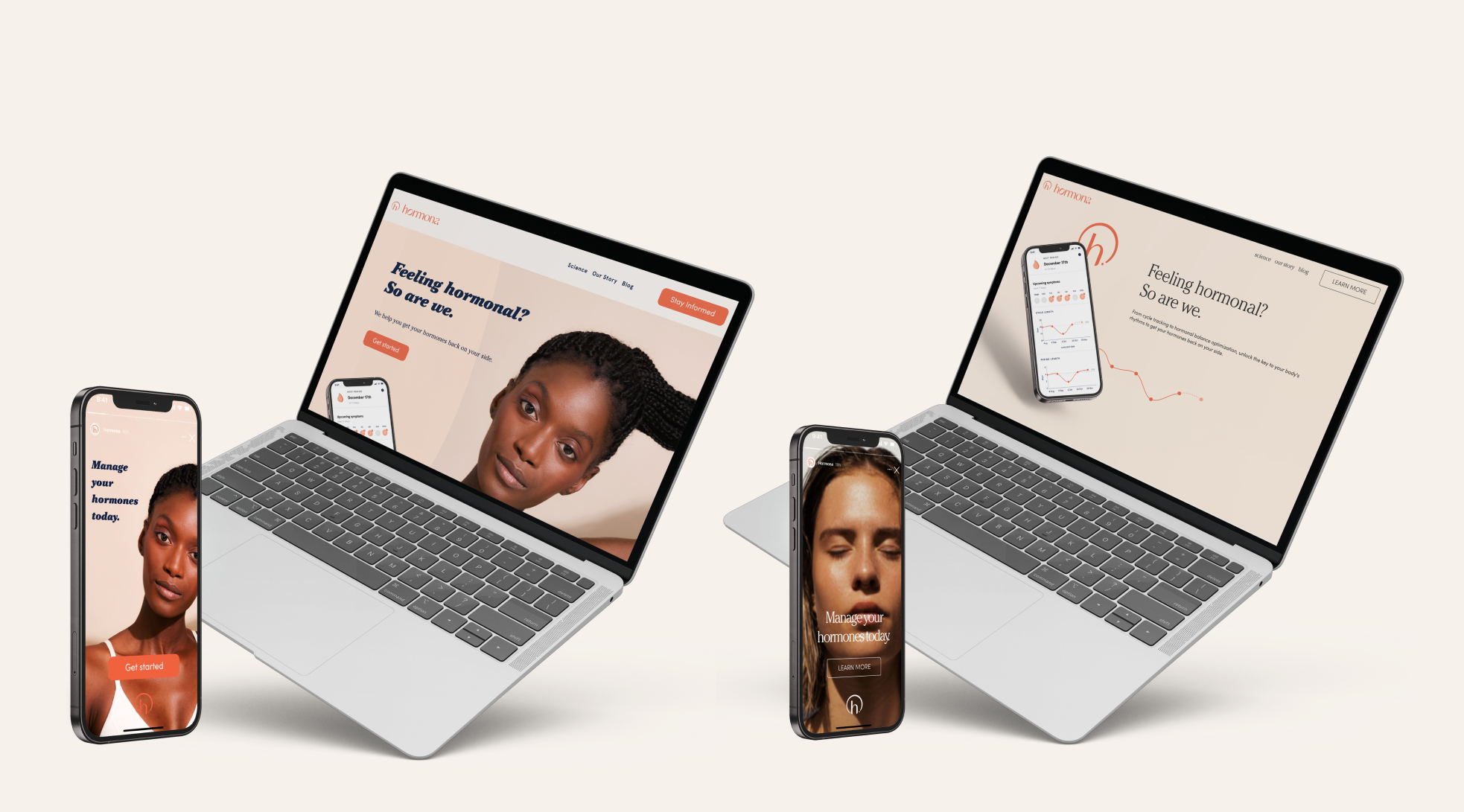
“B” Test: the new proposed solution
The testing funnel
From Instagram ad to website & sign up, we would track the funnel, drop offs, and measure the overall engagement with both websites. We would then take this data back to the founders and investors to weigh in overall stakeholder feedback.
Results
“A” test:
The original held up well in both conversions to the app and website. The rage clicks and bounce rates were slightly higher than the new solution, but what was most concerning was the funnel to the website and then to the app download.
“B” test:
The new proposed solution, tested very well. It outperformed the old website in almost every metric, but what we found interesting was the conversion to the website was higher than the old website, and while the conversion to the app was slightly lower, the slightly lower conversion was marginal, especially if more users would be coming to the page from Instagram in the first place.


Reflection
After the testing the new solution against the older website, it was illuminating to see that consumers actually preferred the new look and feel. We felt we were able to unlock a new realm of aesthetic, and redefine what a medically legitimate wellness brand could look like. It gave all the stakeholders a piece of mind to be able to know that the new website we were implementing was statistically more successful in converting ads to landing on the website, as well as better website engagement and app download.
Having the data in hand to show the investors provided them confidence not only in our new website product, but also how we run our product team. This secured another round of funding and new partnerships fora critical next stage in the Hormona product development.